Showing posts with label Research. Show all posts

Saturday, 3 November 2012

William Control Promotional Posters

(By Rebecca)


William Control's existing promotional posters do follow a set of conventions, especially when it comes to the layout;

  • The William Control logo is included on every poster and CD packaging he releases, with the title of the release placed directly beneath it
  • He uses a dark grey or black background, which has a textured overlay.
  • He uses a light grey or white font, to ensure that it stands out as much as possible and that it is legible from the first glance.
  • Each poster features a portrait photograph of William; in our poster, we will also have a portrait photograph of our main character
  • We liked the striped texture used on the bottom left poster, this is something we may take inspiration from whilst creating our poster.

Album Artwork Inspiration

(By Rebecca)


Placebo - 'Meds'

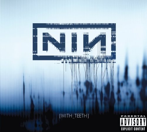
Nine Inch Nails - 'With Teeth'


Marilyn Manson - 'Golden Age of Grotesque' and 'Holy Wood'


HIM - 'Razorblade Romance'


The Cure - 'Disintegration'


Album Artwork - Conventions

(By Rebecca)


Through research, I have picked up on some of the conventions of album artwork, particularly album covers. I have noticed that there are conventions that are unique to each genre of music;
  • Pop - Covers usually feature a photograph of the artist / group on the front of the album. Light or bright coloured backgrounds are common. Text is usually along the top or bottom of the cover, horizontal and the font is chosen to fit with the photograph - for example, a picture of an artist smiling might mean a more handwritten-looking font, whereas an image of someone in sunglasses would mean a more 'block'-looking font.
  • Rock - The band's logo is an essential part of the front cover. Background is often black or grey, or another dark colour and the text is often white to contrast against this. The more 'commercial' the band, the more likely they are to have an image of themselves on the front cover; I would assume this is because they are more recognizable / marketable than underground bands.
  • Electronic - Most album covers for electronic artists are very minimal, focusing more on colour, texture and pattern than on a character. Text is often considerably smaller than on that seen in other genres.
  • Metal - Metal albums can either lean more towards the conventions of rock albums, or can include an artwork. Many classic metal bands use incredibly detailed paintings, whilst newer bands use images that could be considered 'fine art photography' or 'documentary photography'. Some bands opt for 'shock value' by using a gory, controversial image.
  • Gothic - Often minimal use of colour, with high levels of contrast. As well as black and white, there may be inclusion of another dark colour to add accents; eg. crimson red, plum, purple or midnight blue. Follows some of the conventions of electronic covers.
  • R&B and Hip Hop - Follows many of the conventions of the pop album cover. The more underground the artist, the more likely they are to use a photograph that is more towards art or making a statement than portraiture. Like in metal, images may be used for shock value, however Hip Hop is more likely to do this through humour than through gore.

Friday, 2 November 2012

Music Promotional Posters

(By Lauren)


The name of the artist and album name is in large capital fonts. This makes them both stand out to the audience which helps promote the album. This is a convention used on all CD/Album advertisements, therefore they have used the original convention well. White font is used which works well against the dark background. The font of the artists name has a paint look effect to it as there are drips hanging at the bottom of it. This is different and relevant as it against a wall, therefore it looks like graffiti and paint painted onto the wall. The image is in the middle of the advertisement with a fire colour background. This symbolises danger and relates to genre of Green Day's music. On this advertisement it states a well known song that the album includes which will encourage the audience to buy the album. This is one of the main aspects of the advertisement which will help sell the album more. It addresses to the audience the release date of the album which is also another convention of an album advertisement. 


The band is the main focus point on this magazine advertisement as they are seated and positioned in the middle. Two simple colours are used on this advertisement; black and white. This includes their costume, the titles and set. The colouring and style of their clothes relates to the genre of their music; indie. This will help address and promote the album to their particular target audience. The fact that there is only one man dressed in white could indicate that he is the lead singer in the group. It makes him stand out the most of the 5 members. The furniture looks as if it is set in a house as they are sat on a sofa with a coffee table in front of them. There are also posh looking curtains behind them on either side. The fact that it is set in a house relates to the albums name "Strange House". The set contrasts with the costume that they are wearing. This is because their clothing is more modern and not as classy as the props furniture used. It includes the release date which is one of the main conventions of a album advertisements.  The commentary at the bottom, for example from the Guardian newspaper sells the album to the audience and positively talks about the album. At the bottom there is also an advertisement for the bands tour. Therefore, this shows that they are big, have a wide audience and are well known. 

Thursday, 1 November 2012

Lauren's Analysis of Hate Culture Scans

(By Lauren)
SCANS OF ALBUM ARTWORK FROM WILLIAM CONTROL'S DEBUT ALBUM 'HATE CULTURE'

The images used in these Hate Culture scans relates to our music video. This is because body images of the artist William Control is used on this Hate Culture Scan and in our music video we also have body images of a character. It also relates to our ancillary products; a CD packaging and a Magazine advertisement. The similarities are that we have also chosen to use a dark colour theme as this relates to the genre of our video. It creates the right atmosphere and mood we intended to create. The dark look also makes the images stand out more and are more eye catching for the audience.

The rope used in this reflects our music video as at the beginning of it the audience see a strong image of this tied around a girl. This creates a eerie and scary mood atmosphere. It is also quite intriguing and disturbing. 

We have also chosen to use white font on our ancillary products as it stands out against the black background - the two colours work well together. We have also used the colour in one of our ancillary products but in a different way and for different reasons. It is used as blood on the main characters hands, this relates to our video as a lot of blood is seen and used throughout the video. However, the colour red on this Hate Culture Scan is used for the titles of William Control songs. 

This Hate Culture Scan has a worn and distressed texture to it. However, we have used a different texture on our ancillary products. 


Wednesday, 8 August 2012

Representation of Women

(By Lauren)

Music video producers of today represent girls by 'borrowing' an old stereotype from the showgirls of the silent film era in the 20's and Burlesque girls from even earlier.

Characteristics of the Burlesque girl:
*Corsets
*Feather boas
*Fishnet stockings
*Props/ accessories such as whips and canes
*Elbow length gloves

Another stereotype of women in music videos is 'The Stripper'. These characteristics include:
*Bra's and G-strings
*Close up shots of girls wiggling their bums
*The open crouch
*Pole dancing/ dancing on men


A third stereotype would be the women impressing the stereotypical gangster male. The characteristics of the women would be:
*Afro-American women
*Torn shorts/exposure of body
*Bikini tops
*Krumping moves
*Bling jewellery
*Tattoos on body and piercings

These representations have an effect on girls in the real world as they are coping the appearance, attitude and lifestyle of the celebrities in the media. The messages of these representations are that girls are cheap, easy and passive. They are to be watched by men in a sexual way, to satisfy their needs and to give them pleasure. This is called the male gaze which Laura Mulvey explored in her Feminist theory. A good example of this is the song 'Lollipop' by Lil Wayne. Therefore, women are often represented in a negative light in some music videos. Children need to be protected from seeing these kind of images and videos as it give them a bad impression of women and will warp their views of them.

Tuesday, 7 August 2012

Women in Music Videos

The representation of women in music videos is a widely discussed, ever changing and often controversial issue. It is also highly relevant to us, as our main character will be female.


Women in music videos, particularly in that of male artists within the Pop / R&B / Hip Hop genres, have long been objectified. The stereotypical hip hop video, for example, is that of the male artist being surrounded by a crowd of attractive women dancing 'for' him. An example of this is in Lil Wayne's video for 'Lollipop'.  This video is extremely popular, with over 110 million views on YouTube. The women that surround him are all wearing similar clothes and are part of a large group. Personally, I think his creates the impression that they are interchangeable, and strips them of some of their identity. It also shows that they are intended to be objects, which Lil Wayne can pick and choose from as he likes.


In the videos of female artists, the representation of women can also be pretty poor. For example, a lot of videos - such as Avril Lavigne's 'Girlfriend', Paramore's 'Misery Business' and Taylor Swift's 'You Belong With Me' - pit the female characters against each other. The women are often seen fighting against each other for the attention of the male character, once against suggestive that the women are submissive. It also conveys the misconception that women are 'bitchy' and 'catty' towards each other, whereas men support and encourage each other.


In my opinion, criticism of the portrayal of women in music videos often focuses on the wrong area - saying that the negative thing is the revealing or provocative clothing. However, hinting that the women should 'cover up', in my opinion, is just as anti-feminist as the portray itself. Instead, I think the problem lays in the way that the men and women are seen to be interacting with each other in the videos. The women are often seen to be submissive through the fact that they are dancing around the central male artist and that there are many woman to each man. The idea of male gaze is also applicable, as the camera is often angled or moved to linger on or follow the curves of the woman's body.  There is no such focus on the body of the male artist, who is displayed as dominant and in control, and this inequality causes problems.

Fortunately, it is not all negative! Many female artists are stepping away from these representations, and portraying themselves as strong and independent in their music videos. Unfortunately, you often find that these artists are less well known. However, I am aware that most movements of change start underground before growing into the mainstream, so I am hopeful that there are more varied representations of women in the future.


Monday, 6 August 2012

History of Music Videos

(By Lauren)

History of music videos. To see below image click on this. (Source is MySpace.com)

1894:
The first step towards a music video was created in this year.
Song title: The little lost child
By: Edward B. Marks & Joseph Stern

They used a magic lantern and projected a series of still images on a screen to live performances. This would become popular and known to everyone as the illustrated song. It sold more than 2 million copies of its sheet music.

1902-1917: Phonoscene era
This was a big development within the sound film industry. It was a combination of a chronophone sound recording with a chronograph film shot and actors lip-synching to the recording sound. The first phonoscene was presented by Gaumont in 1902 in France.

1926-1959: Talkies, soundies, and shorts
In 1926 many musical short films were produced as Talkies were introduced. Animation artist Max Fleischer introduced a series of sing-along short cartoons called Screen Songs. This invited audiences to sing along to popular songs.

Musical films were another important precursor to music video, and several well known music videos have imitated the style of classic Hollywood musicals from the 30's to the 50's. According to the Internet Accuracy Project, disk jockey singer J.P, The Big Bopper, Richardson was the first to coin the phrase music video in 1959.

1960-1973:
In the late 50's a visual jukebox was invented in France and short films were produced by many French artists.

1974-1980:
UK: Top of the pops began playing music videos in the late 1970's.

1981-1991:
Music videos went mainstream and MTV launched 'Video Killed the Radio Star'.

1983:
The most successful and influential music video of all time was released: 'Thriller' by Michael Jackson.

1992-2004: The rise of directors
Two videos directed by Romarek in 1995 are notable for being 2 of the 3 most expensive videos of all time. These are Michael and Janet Jacksons song 'Scream' costing $7 million to produce and Madonna's 'Bedtime Story' costing $5 million.

2005: The Internet becomes video friendly
The earliest purveyors of music videos on the internet were members of IRC based groups. They recorded them as soon as they appeared on TV then digitised them.

2005: Launching of Youtube & i Tunes
This made viewing of online videos faster and easier. Apple made music videos available to buy through i Tunes.

Edited from: http://en.wikipedia.org/wiki/Music_video.

Sunday, 5 August 2012

William Control Music Video Analysis

(By Lauren)


The specific choice of animals and images used in this video create an eerie and uncomfortable atmosphere and makes the audience on edge. The cuts become faster as the music gets louder this creates tension and suspense holding the audiences attention. Different shot sizes are used but mostly close ups and medium close ups of the artist. This shows the conventions of music videos within this genre and brings the focus back to the artist which brings the audience closer to him. The colour black is mostly seen in this video, this creates a dark dull mood and shadowy atmosphere. The Raven and horse used at the beginning of the video are literary references. The smoke in the video is a trade mark of the artist as he is always smoking in his promotional material. The doll used contrasts with the idea of the video and the lyrical content of the song. This is because dolls in reality represent innocence, childhood and beauty and the video does not connote any of these. The words 'Inside' 'Love' 'Lie' 'Loser' and 'Bleed' shown are strong meaningful words which relate to the song. Towards the middle of the video lots of flickering effects are used disorientate the viewer and are used as cuts to go from one scene to another.


The beginning of the video begins the narrative of video as it introduces the main character to the audience. In the video the artist is smoking again which links all of his videos together. There is limited light used, however there is artificial light which creates a lot of shadows and areas of darkness. The gun held by the main character throughout the video demonstrates that she is the main antagonist. The part where the artist lies on the bed dead covered in blood concludes the narrative that has ran through the 'Only Human Sometimes' video as well as this video; 'Kiss me Judas'. This narrative is inspired by the book 'Kiss me Judas' written by Will Christopher Bear. The end is left open ended when the timer runs down to 0 on the antagonists phone.

Saturday, 4 August 2012

Other Music Videos of a Similar Genre

(By Rebecca)

Type O Negative, Black No. 1


Things that we were inspired by in this video;
  • The use of black and white
  • The use of lighting to create highlights and shadows, this makes the characters appear as if they are appearing from darkness
  • High levels of contrast in the character shots, which highlights movement and expression
  • We preferred the shots outside of the band shots, particularly the opening
  • We liked the use of the title screen at the beginning

Joy Division, Atmosphere


Things that we were inspired by in this video;
  • The use of black and white to connect seemingly unrelated image and make the audience think of connotated images
  • Interesting use of still photographs in the video
  • The band are featured in the video through a way other than performing. This makes them appear to be a part of the video's concept as a whole.
  • The music and video fit incredibly well together! 

Thursday, 2 August 2012

Nine Inch Nails Music Videos

(By Rebecca)

We have decided to look more closely at the music videos of the band 'Nine Inch Nails', as both their music and imagery is of a similar 'genre' to that of William Control. Their music is cinematic and atmospheric, meaning they have some quite incredible music videos that we can take inspiration from. Trent Reznor (the only member of NIN, excluding live members) has gone on to collaborate with Atticus Ross to create some of the most well received film scores / soundtracks of the past decade (Girl With The Dragon Tattoo [2012], The Social Network [2010]).

'We're In This Together (1999)'


This video uses a monochrome colour scheme, unusual camera angles and fast cuts to create a disorientating, dream-like effect. I really like the use of shadows, particularly the crosses of the wire on Trent's face and the shadows of the group of men running down the road. The flickering lights and fast moving groups of people, teamed up with the accelerating music in the chorus create a sense of complete chaos. However the fact that the crowds are in rows allow for a different interpretation; are they under orders or a form of mind control? The effect created by the strong backlighting in the tunnel looks stunning, especially as the shadows of runnign people cut through it. The extreme close-ups of people's faces towards the end helps the audience to empathise with the characters more, gradually they are gaining an identity rather than just being a part of a faceless crowd. The still shot at the end brings the video to an interesting conclusion. Overall, I think this is one of my favourite music videos because the imagery really enhances the mood of the song. This is something I definitely want to bring to our music video.

'Closer (1989)'


The video for 'Closer' is perhaps Nine Inch Nails best known music video. It uses a warm, rusty brown colouring and flickering aged effect, which help to stylise the video and fit all of the shots together. Unlike the previous video, there is no clear connection between the images shown and the lyrics of the song. However, the look of the video works well with the pulsing beat of the music, creating a result that both makes my skin crawl and intrigues me!


 'Into The Void (2000)'


This video is different from the previous two in that it uses very light and bright, realistic colours. I looked at this video particularly because it included very close-up body shots and this was something we were going to include in our video. The shots of his eyes are effective because eyes are subtly expressive, and I really like the idea of having close-up shots of the mouth miming to the lyrics.

How can we take inspiration from these videos?

The video for 'We're In This Together' achieves a lot of the effects that we are striving to achieve in our own music video. It's use of high contract and crowded imagery enhances the sense of paranoia, mass panic and claustrophobia. The black and white crowds brings a closeness that could easily be lost with the scale of some of the shots - as the audience, I feel a sense of empathy with the main character and I experience the video with him. It follows the convention of focus / lots of close-ups on the singer and lip syncing shots, without making them look contrived or typical.

Wednesday, 1 August 2012

William Control Research

(By Rebecca)


Basic information about the artist;
  • Artist;     
    •  William Control
  • Genre;    
    •  Electronic / Darkwave / Gothic / New Wave
  • Albums;  
    • Hate Culture (2008), Noir (2009), Novus Ordo Seclorum EP (2011), Silentium Amoris (2012)
  • Singles With Music Videos;
    • Beautiful Loser (2008), Deathclub (2009), I'm Only Human Sometimes (2010), Kiss Me Judas (2012)
  • Influences;
    • Joy Division, New Order, Depeche Mode


William Control was created in 2008 by Aiden frontman, William Francis. In interviews with Kerrang Magazine and through posts on his MySpace page, William explained that William Control was born to allow him to explore making music that was out of the genre of Aiden (a punk band, with horror influences) and also as an outlet for him during a troubled time in his life. William Control is a semi-autobiographical alter ego, and his debut album 'Hate Culture' told the story of a man's last day on earth before he plans to commit suicide. His music explores dark, controversial topics such as suicide, sadomasochism and religion, but is also extremely personal. William Control has gone on to release three more CDs, 'Noir', 'Novus Ordo Seclorum' and 'Silentium Amoris' and has toured extensively all over the world.

Andrew Goodwin's Music Video Theory

(By Rebecca)


Andrew Goodwin's book 'Dancing in The Distraction Factory', published by the University of Minnesota Press in 1992, was the first book to focus on MTV and music videos in popular culture. In it, Goodwin proposes a 'music video theory' - pointing out the common features and conventions of the music video, as well as the techniques used to attract it's intended audience and promote the artist's product. Although written over two decades ago, it is still very applicable to the music videos made today, particularly those within popular and mainstream music genres.

  • Music videos have genre-specific conventions and characteristics - For example, pop videos often feature women dancing, electronic music videos use bright colours and graphics, whereas indie rock videos include lots of band shots.
  • There is a relationship between the lyrics and visual aspects of the video - The imagery used in the video can either illustrate the lyrics, amplify / draw attention to them or contradict them.
  • There is a relationship between the music and visual aspects of the video - Once again, the visuals in the video can either amplify the beat of the music, and 'flow' with it's rhythm or purposefully contradict the beat to attract attention to it.
  • There is a focus on the artist in the video - Record labels often demand that a lot of focus is put on the artist, usually resulting in a lot of close-up lip-syncing shots, as this is a good means of promotion. Also, artists may develop recognisable 'trademarks' through music videos, which will be cohesive / be included in their other promotion material.
  • There is a notion of looking and the male 'gaze' - A lot of music videos are filmed in a way that follow the 'male gaze'. For example, a voyeuristic view of the female body is common. In addition to this, focus on the artist helps the audience to connect more with them, as they are looking at them for a longer period of time.
  • Intertextual references (to other media products) are common in music videos - Music videos can reference films, books and TV that their target audience would be familiar with.
This theory is important for us to look at before we create our media product, as it highlights the conventions of the music video; allowing us to decide which conventions we want to follow and which we want to challenge. It also gives us things to look out for whilst analysing music videos from our chosen artist and from other artists within the genre.

Tuesday, 3 July 2012

Lyrics To 'Come Die With Me'

Change, a thousand ways to paint the picture bleak. Do I stutter? Hate. Hate is just another word for love. Are you with me? Sound, the written word means more to me than sex, by a long shot. But ah love, love is just another price we pay. Oh, come die with me. Please lay down your sorrow. Close your eyes don't be afraid. I have always loved you, I will always love you. Die with me. Now we lay down your soul to rest. Close your eyes yeah embrace the pain. I have always loved you, I will always love you. Faith. Are just frightened of the prospect death. Are you lonely? Lust, the need for something greater than a cure. I can save you. Lies, the needle scratched and bleed the surface dry. I'm a goner. But your love, I can count the beats within your heart. Walk with me, some will say. Turn your back, fall away. You'll see. Oh, come die with me. Please lay down your sorrow. Close your eyes don't be afraid. I have always loved you, I will always love you. Die with me. Now we lay down your soul to rest. Close your eyes yeah embrace the pain. I have always loved you, I will always love you. Die with me. Die with me. Light will fade, all the love. Fall away, die with me, some will say. Take the pain, I will stay. But I have always loved you, I will always love you. Oh, come die with me. I have always loved you, I will always love you.