Saturday, 3 November 2012

William Control Promotional Posters

(By Rebecca)


William Control's existing promotional posters do follow a set of conventions, especially when it comes to the layout;

  • The William Control logo is included on every poster and CD packaging he releases, with the title of the release placed directly beneath it
  • He uses a dark grey or black background, which has a textured overlay.
  • He uses a light grey or white font, to ensure that it stands out as much as possible and that it is legible from the first glance.
  • Each poster features a portrait photograph of William; in our poster, we will also have a portrait photograph of our main character
  • We liked the striped texture used on the bottom left poster, this is something we may take inspiration from whilst creating our poster.

Album Artwork Inspiration

(By Rebecca)


Placebo - 'Meds'

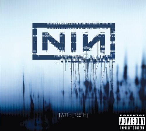
Nine Inch Nails - 'With Teeth'


Marilyn Manson - 'Golden Age of Grotesque' and 'Holy Wood'


HIM - 'Razorblade Romance'


The Cure - 'Disintegration'


Album Artwork - Conventions

(By Rebecca)


Through research, I have picked up on some of the conventions of album artwork, particularly album covers. I have noticed that there are conventions that are unique to each genre of music;
  • Pop - Covers usually feature a photograph of the artist / group on the front of the album. Light or bright coloured backgrounds are common. Text is usually along the top or bottom of the cover, horizontal and the font is chosen to fit with the photograph - for example, a picture of an artist smiling might mean a more handwritten-looking font, whereas an image of someone in sunglasses would mean a more 'block'-looking font.
  • Rock - The band's logo is an essential part of the front cover. Background is often black or grey, or another dark colour and the text is often white to contrast against this. The more 'commercial' the band, the more likely they are to have an image of themselves on the front cover; I would assume this is because they are more recognizable / marketable than underground bands.
  • Electronic - Most album covers for electronic artists are very minimal, focusing more on colour, texture and pattern than on a character. Text is often considerably smaller than on that seen in other genres.
  • Metal - Metal albums can either lean more towards the conventions of rock albums, or can include an artwork. Many classic metal bands use incredibly detailed paintings, whilst newer bands use images that could be considered 'fine art photography' or 'documentary photography'. Some bands opt for 'shock value' by using a gory, controversial image.
  • Gothic - Often minimal use of colour, with high levels of contrast. As well as black and white, there may be inclusion of another dark colour to add accents; eg. crimson red, plum, purple or midnight blue. Follows some of the conventions of electronic covers.
  • R&B and Hip Hop - Follows many of the conventions of the pop album cover. The more underground the artist, the more likely they are to use a photograph that is more towards art or making a statement than portraiture. Like in metal, images may be used for shock value, however Hip Hop is more likely to do this through humour than through gore.

Friday, 2 November 2012

Music Promotional Posters

(By Lauren)


The name of the artist and album name is in large capital fonts. This makes them both stand out to the audience which helps promote the album. This is a convention used on all CD/Album advertisements, therefore they have used the original convention well. White font is used which works well against the dark background. The font of the artists name has a paint look effect to it as there are drips hanging at the bottom of it. This is different and relevant as it against a wall, therefore it looks like graffiti and paint painted onto the wall. The image is in the middle of the advertisement with a fire colour background. This symbolises danger and relates to genre of Green Day's music. On this advertisement it states a well known song that the album includes which will encourage the audience to buy the album. This is one of the main aspects of the advertisement which will help sell the album more. It addresses to the audience the release date of the album which is also another convention of an album advertisement. 


The band is the main focus point on this magazine advertisement as they are seated and positioned in the middle. Two simple colours are used on this advertisement; black and white. This includes their costume, the titles and set. The colouring and style of their clothes relates to the genre of their music; indie. This will help address and promote the album to their particular target audience. The fact that there is only one man dressed in white could indicate that he is the lead singer in the group. It makes him stand out the most of the 5 members. The furniture looks as if it is set in a house as they are sat on a sofa with a coffee table in front of them. There are also posh looking curtains behind them on either side. The fact that it is set in a house relates to the albums name "Strange House". The set contrasts with the costume that they are wearing. This is because their clothing is more modern and not as classy as the props furniture used. It includes the release date which is one of the main conventions of a album advertisements.  The commentary at the bottom, for example from the Guardian newspaper sells the album to the audience and positively talks about the album. At the bottom there is also an advertisement for the bands tour. Therefore, this shows that they are big, have a wide audience and are well known. 

Font Choices

(By Rebecca)
I have started to think about the font we may use for the title on our ancillary products. To go along with the title of the song, I wanted something swooping and classic, but with a mysterious edge. I thought splitting up the title into three lines in this way would be a possibility, as it is quite long.

Thursday, 1 November 2012

Lauren's Analysis of Hate Culture Scans

(By Lauren)
SCANS OF ALBUM ARTWORK FROM WILLIAM CONTROL'S DEBUT ALBUM 'HATE CULTURE'

The images used in these Hate Culture scans relates to our music video. This is because body images of the artist William Control is used on this Hate Culture Scan and in our music video we also have body images of a character. It also relates to our ancillary products; a CD packaging and a Magazine advertisement. The similarities are that we have also chosen to use a dark colour theme as this relates to the genre of our video. It creates the right atmosphere and mood we intended to create. The dark look also makes the images stand out more and are more eye catching for the audience.

The rope used in this reflects our music video as at the beginning of it the audience see a strong image of this tied around a girl. This creates a eerie and scary mood atmosphere. It is also quite intriguing and disturbing. 

We have also chosen to use white font on our ancillary products as it stands out against the black background - the two colours work well together. We have also used the colour in one of our ancillary products but in a different way and for different reasons. It is used as blood on the main characters hands, this relates to our video as a lot of blood is seen and used throughout the video. However, the colour red on this Hate Culture Scan is used for the titles of William Control songs. 

This Hate Culture Scan has a worn and distressed texture to it. However, we have used a different texture on our ancillary products.